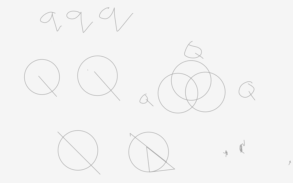
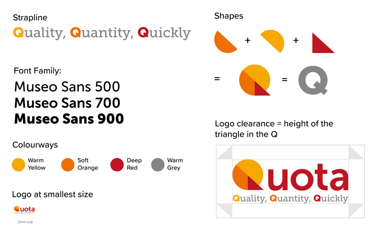
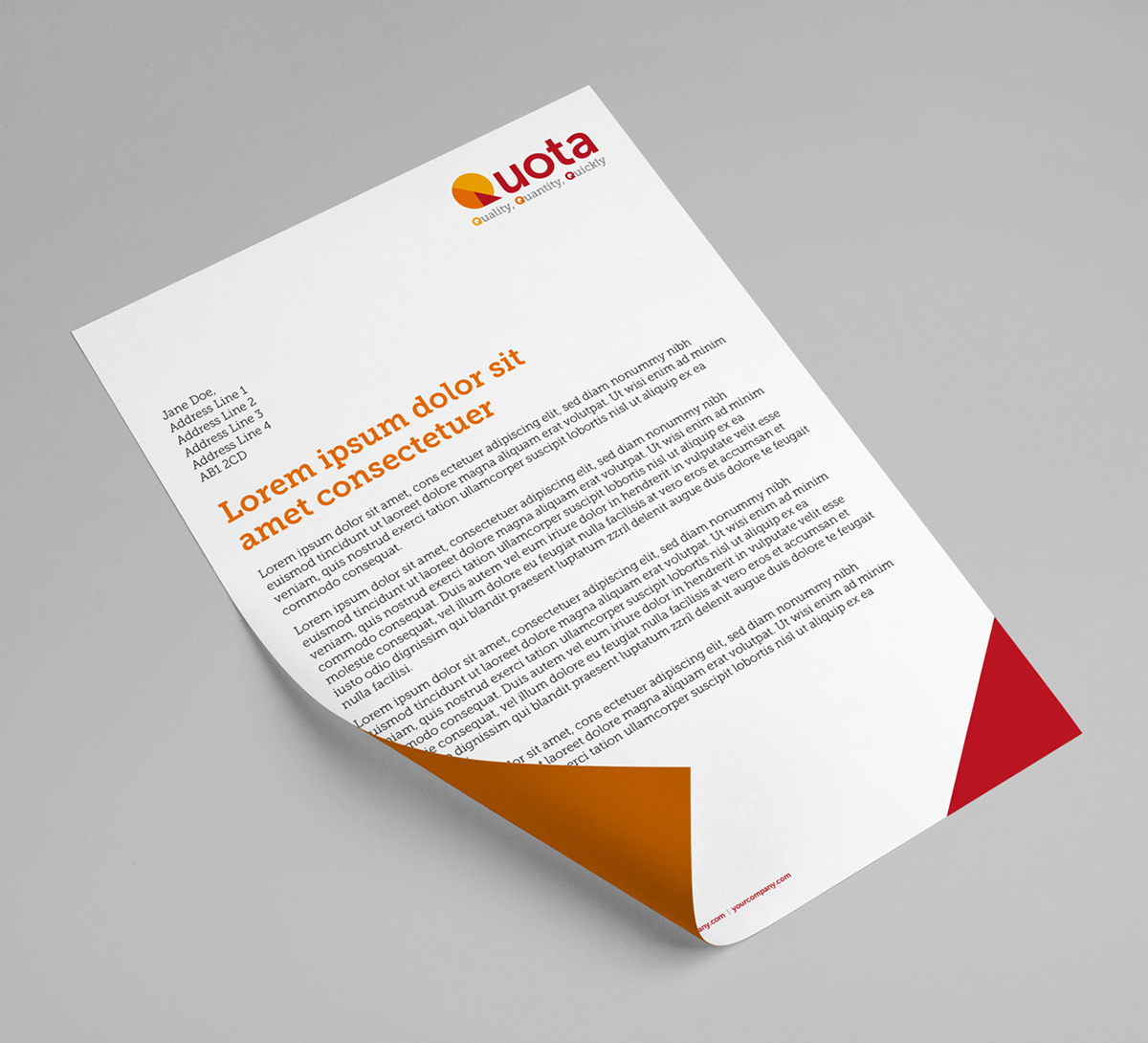
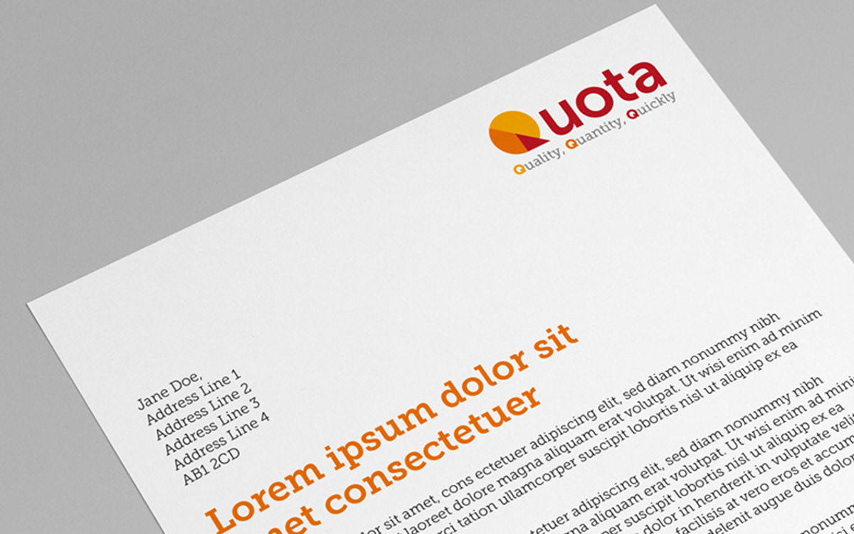
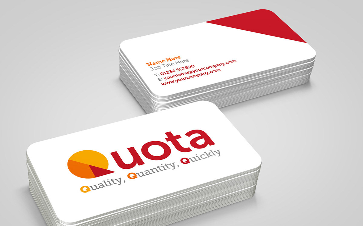
The brief was to design a brand for a company who sells ceramics to high street shops such as mugs to coffee shops. The company name is 'Quota' with a dictionary definition of “a fixed, limited amount or number that is officially allowed”. The client wanted a bold brand which incorporates their three values 'Quality, Quantity, Quickly'. The symbol in the logo represents a plate as a visual que to what the company sells, this also forms the letter ‘Q’ by using geometric shapes. As part of the brand system I used a complimentary primary colour palette of warm colours such as yellow, orange, red and grey. To balance the logos simplistic symbol, I selected a complementary slab serif.