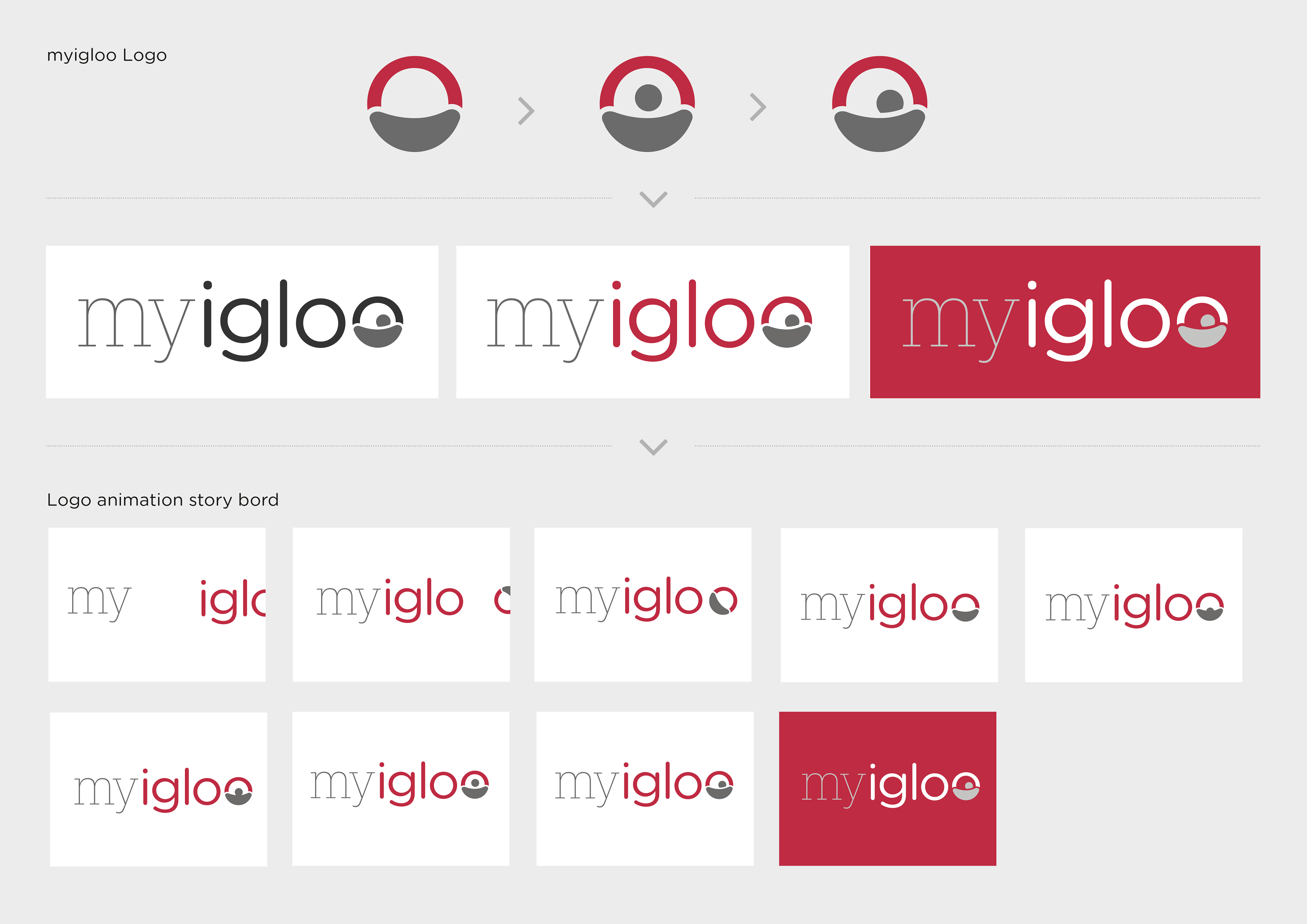
The brief was to design a brand and website or app for a fictional start-up online Estate Agent with Purple Bricks and Yopa as direct competition. The company is 'my igloo' with 'igloo meaning home in Inuit'. I wanted the brand to be approachable but taken seriously so combined a Slab Serif with a Soft/Rounded font. I introduced the use of negative space which forms an igloo shape with the last 'o'.

The 'o' in the logo can be animated to go from a person with their head popping up to a person at rest (representing the individual 'my') and with the igloo in the negative space, see examples below:
The brief gave a choice of between an app or a responsive website. I decided to go with a responsive web design, which includes a member’s area that is available for customers who have registered with my igloo and is more cost-effective solution and easier to keep updated.
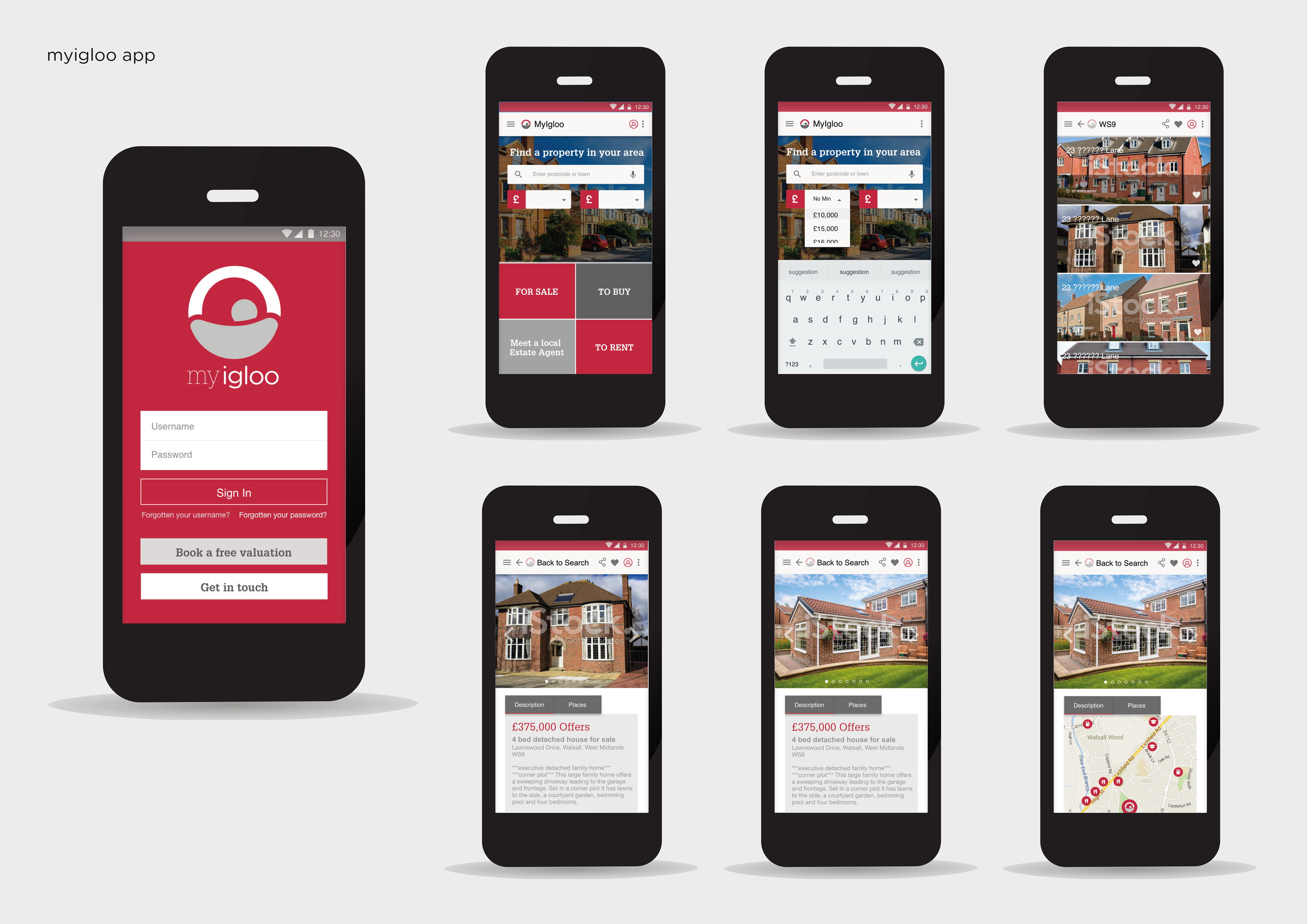
Click to try some of the prototype app functions